Sindroms – Meet the founders behind our latest magazine addiction!
If you’re into colour, visual art, photography, aesthetics and printed magazines – you might have come across the magnificent magazine Sindroms.
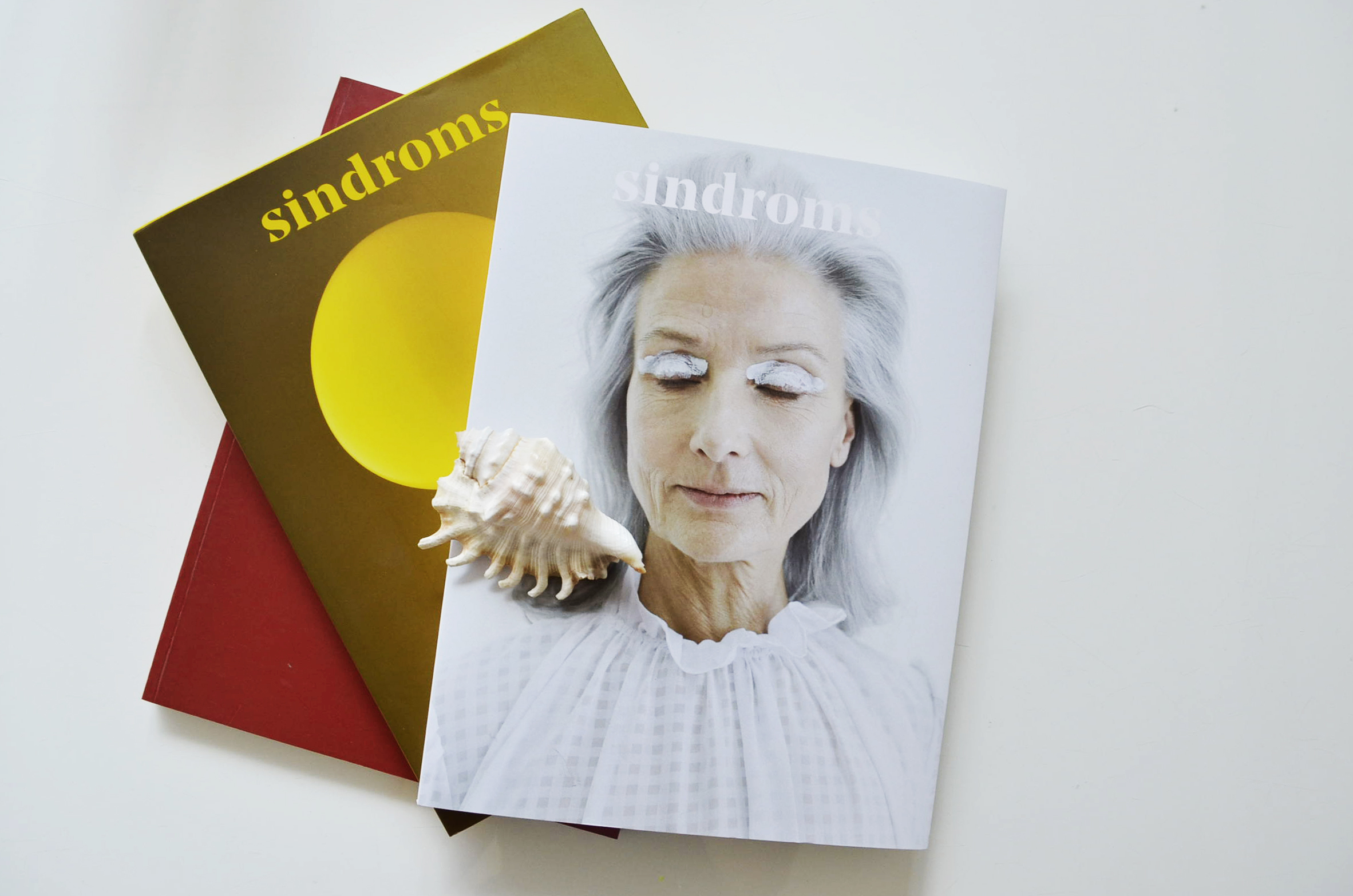
Holding the first issue in our hands, our immediate impression was: this is genius. The whole concept of the magazine is built on a simple, yet very powerful idea – the interpretation of colours.
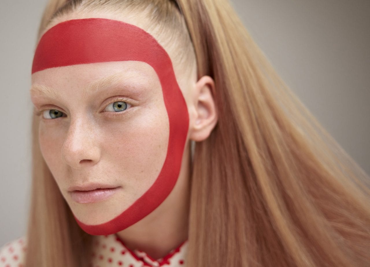
Each colour has not only a general meaning, but every person has an individual perception of them. The magazine’s first issue was inaugurated with a powerful one. The colour red. Red Sindrom is a feast – physically, visually and regarding the content. It took us into the universe of red and affected our sense in new ways, by challenging us to understand the colour from different perspectives.
The clean, clear concept comes to life through precisely curated graphics and photos, along with inspiring stories and interviews, all wrapped up like a book, but yet in a magazine form with thick and silky touched quality paper. The Copenhagen based biannually released magazine brings a gripping experience, presenting high-quality art, photography, and storytelling through a red lens.
We at UPTOSTYLE were curious to find out more about the journey from idea to implementation and how such a unique idea evolved into a magazine, so we got an interview with the founders Miruna Sorescu and Ana Teodorel, two of the masterminds behind Sindroms.
UPTOSTYLE: Hi, Ana and Miruna. Tell us a bit about yourself – how did your background and relationship form the magazine as it is today?
Miruna: Both Ana and I are originally from Romania and now living in Copenhagen, which is also where we publish Sindroms. Having worked together, being friends outside of work and sharing many interests, it came quite naturally to team up as entrepreneurs as well. Moving to Denmark was definitely a starting point to this journey, as that’s when we started discovering the independent publishing market and lots of amazing magazines made by creative people with something to say. There wasn’t really a market in Romania at the time – and while there are now a few independent magazines, it’s still not comparable in any way to Scandinavia. And there are not a lot of places where you can go and find a big selection of independent magazines.
Ana: Miruna and I grew with eagerness to start our own business, so when the idea of Sindroms was born, it was only natural for us to partner and work on it together. Miruna mentioned our backgrounds, starting from a country in which the independent print scene was not that evolved, and yet there is so much space for creative projects, many of which I have seen come to life within the past few years. Our background was like a blank canvas – we knew we wanted to paint at some point, so with Sindroms we immediately saw the fit with this wish we both shared.


UPTOSTYLE: What is the story behind the name?
Miruna: Sindroms as a name was born out of the wish to illustrate somehow this obsessive compulsiveness of organising things by colour, and the overwhelmingly intense sensation of reading a magazine whose content is all in one single colour. We kind of wanted each issue to be its own ‘syndrome’, which is also why each issue has its own title, starting with Red Sindrom.
UPTOSTYLE: What does the colour red personally mean to you and why did you choose red as the first theme for Sindroms?
Miruna: We made a lot of research on colour psychology in the beginning, and even conducted some focus groups to get some insight in how colour affects people and what different reactions that get triggered in them. We wanted to begin with a statement colour, something powerful that would be attention-grabbing and that wouldn’t have a very strong association with it – so there would be no bias. That’s why we went with red – it’s a very complex and strong colour, having a lot of different associations with it – both positive and negative – and being, above everything – unignorable.
Ana: And we were also intrigued by red. I used to stay away from it, associating it with a wish for attention when used too much, but on the other hand, I was interested in red used as a detail. So this perceived ambivalence of it was very interesting to me. We decided to use it exactly because it’s such a powerful colour and it instantly attracts the eye, leaving a lot of place for exploration because of this – ‘you either love it or hate it’.
UPTOSTYLE: What is your main mission with the magazine?
Miruna: Our main mission is to, with each issue, create monochrome states of mind that our readers can get immersed into. We are trying to use colour as a way of generating experiences, and subjecting readers to different moods and feelings.
Ana: Yes, and also to bring a bit more awareness to places, faces and experiences around us. The visual environment and our perceptions influence our daily choices. It can dictate daily moods and in the end have an impact on our lives overall. Sindroms is deconstructing our daily surroundings, one colour at a time. We hope this brings more understanding and awareness in the present moment, kind of like a visual refresh.


UPTOSTYLE: We are totally fond of the colour-themed concept. What inspired you in an environment mostly dominant by achromatic gloom to devote each of your magazines to one colour?
Miruna: Everything! This is one of the questions we get asked the most, as people think it’s quite brave to go for a magazine about colours in Scandinavia – but being here has obviously inspired us to do more of what we were missing, and the response here in Copenhagen as well as Stockholm was really good – so perhaps it was not just us longing to see something more colourful. While Scandinavia is not necessarily the biggest market for us, as we have much more notable success in countries such as the UK, China, or Germany – it does feel good to be working on this project here, as we get to spark some colour into Copenhagen (and our lives here) as well.
UPTOSTYLE: Tell us more about the creative processes. What is your main source of inspiration when creating the whole concept and content?
Ana: The team behind Sindroms has always been a bit artsy. Our interests within the creative field vary from fashion, to graphic design, to music etc, but we have, and continue to construct our own individual aesthetics, which we then merge. The spark here is how our different interests get intertwined. The team vibe, the way we defined our working processes and our lessons learned along the way, made us more receptive to one another and ended up with us creating this common view which is now Sindroms. In terms of people, brands, and stories we choose to work with, we always have the higher goal in our mind: to deliver high quality content and visuals which play with your mind.
UPTOSTYLE: How long did it take from idea to implementation? What were the biggest challenges to you personally to put your ideas into the actual magazine?
Miruna: It took us over a year to put the first issue out there, from the moment we started to work on the concept. But a lot of time in the beginning was spent putting together the team, doing market research, talking to different people in the industry, and figuring out the things we needed to know about publishing a magazine and running a business. As the contributor team was more limited in the first issue, we created a lot of the content, both written and visual, in house – and this was actually great because we had the chance to make a statement and show the direction we wanted to go, and clarify what our vision for Sindroms was. But the timeline is of course reduced drastically now for our second issue, which will be released in April, as we work much faster now knowing the process, and working with a lot more contributors.
Ana: I was mentioning the team dynamics and how we incorporate the lessons learned along the way, and the way we develop creatively. There most certainly are moments in which we fall outside of one another’s ideas, and some of the biggest challenges met along the way were getting everything in place, finding the right structure, and learning to trust each other’s choices. When you’re at the beginning of a journey, especially since this is the first business for both of us, it’s not always easy to see the same end goal while learning along the way. The debut issue for us was a bit of a test, which we think we managed to pass successfully, looking at the engagement Red Sindrom got, and the many more contributors that already are excited to work with us on the second issue.


UPTOSTYLE: Tell us more about your team and the creatives behind it. You have contributors from various nationalities and backgrounds. How did you meet them?
Miruna: Our main team, besides Ana and myself, includes of Monique – our editor in chief – and Kotryna, our communications angel. Kotryna and I studied together here in Denmark, and developed the idea of starting a magazine together, and we were later joined by Monique, whom I met during an internship at Kinfolk magazine. As for contributors, we work with so many different writers, photographers and artists both here in Copenhagen but also based all over the world. Our network played its part of course – we approached people we knew were talented and we wanted to work with, but we also posted calls for contributors to find others. It took us a longer time to find all the contributors we needed for the first issue, as we didn’t really have anything to show yet, but once we had published our first issue so many amazing people wrote us wanting to contribute to the second one. We never thought there’d be a downside to that, but we were sad to not be able to work with everyone we wanted once we couldn’t take in more contributors for the upcoming issue.
UPTOSTYLE: Regarding your content, what is the main inspiration when choosing the topics? Was the starting point the red colour, or the other way around – finding red in each story/interview?
Miruna: The colour is always the starting point. Our process, which is obviously still being defined, starts with a big general brainstorm on the colour where we’re not thinking of articles/stories, but rather everything the colour means to us: it can be words, feelings, objects, taste, etc. We have a few sessions after that where we slowly go more and more concrete, and eventually end up with the content ideas.

UPTOSTYLE: Tell us about the process of releasing the printed magazine.
Miruna: This was of course quite important, because our main goal was to create not just a magazine, but almost a design object: something that would have the feeling of a book or catalogue and something people would display in their homes or on their coffee tables. So the quality and the look-and-feel of the magazine was very important. We tested a lot of different colours on different types of paper and with different finishings, in order to get the best results. Getting the exact colours in print can be quite tricky, and for a magazine about colours there wasn’t really room for mistakes.
Ana: Yes, the color is the central element. After we slowly start deconstructing it from what we have observed around us in macro and micro. This process helps us discover new meanings as well, and as we explore, we add new layers to it. Then of course the whole contributors team is also part of the process along the way. The main structure is the color, the states of mind associated to it, and the rest is pure play.
Ana: For us quality, texture and for sure colour are the most important. They are the means through which we deliver our whole product. If the experience on this haptic level is not pleasant then it will be easy to put the magazine down and forget it in a corner somewhere. We had a lot of print tests, and then we decided what paper goes with what stories, editorials etc. For the first issue we only played with two paper qualities, but the colour palette is quite complex and well thought through as well. The physical appearance is everything. We want our readers to feel immersed and captured by our magazine, as this is what brings the product to life.

Already in April, the next issue Yellow Sindrom will be out. We at Uptostyle are expectant to see where this monochrome colour explosion will take the independent print industry to.
If you’re a design enthusiast and want to decorate your own coffee table with an issue of Sindroms, get your own copy of Red Sindrom at sindroms.com.
Interview by Villő Tóth.
Images from sindroms.com